2 March slots left • April diary now open
Best Tile Colours for a Small Bathroom
In a small bathroom, colour does far more than define style. The right tile colours can make the room feel calmer, lighter and more spacious, while the wrong palette can make it feel tighter, busier or heavier than it really is. The best choice usually comes from balancing light, warmth, contrast and the overall finish direction of the room.
Many people assume that the best tile colours for a small bathroom are simply the lightest ones possible. Sometimes that works, but not always. A bathroom that is too stark can feel flat or clinical, while a bathroom with too much contrast can feel visually broken up. The strongest colour schemes usually create openness without losing warmth or character.
The goal is not to follow one fixed formula. The goal is to choose colours that support the room you actually have, the mood you want to create and the way the finishes work together. When that is done well, even a compact bathroom can feel balanced, premium and much easier to enjoy every day.
Key takeaways before choosing tile colours
- Smaller bathrooms usually benefit from calmer colour transitions rather than stronger visual breaks.
- Light tiles often help, but warmth matters just as much as brightness.
- One clear palette usually works better than several competing tones.
- Grout tone can change the whole effect of a tile colour scheme.
- The best small bathroom colour schemes support both openness and comfort.
1. Why tile colour matters so much in a small bathroom
In a compact bathroom, the eye reads surfaces very quickly. That means colour changes, contrast, grout lines and material shifts all have a bigger effect than they might in a larger room. Tile colour influences whether the room feels connected or fragmented, soft or hard, inviting or slightly overwhelming.
The most successful small bathroom colour schemes usually support one clear visual flow. That does not mean everything has to match perfectly. It means the room should feel coherent rather than divided into too many competing zones.
For the broader design picture, it helps to read Small Bathroom Design Ideas That Actually Make the Space Feel Bigger.
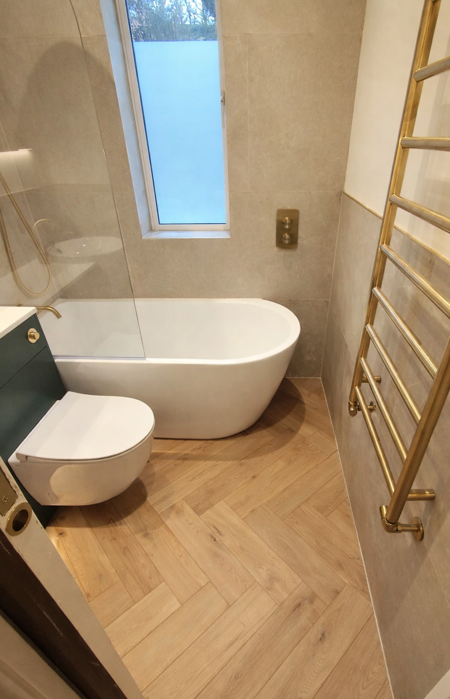
2. Warm neutrals are often safer than cold whites
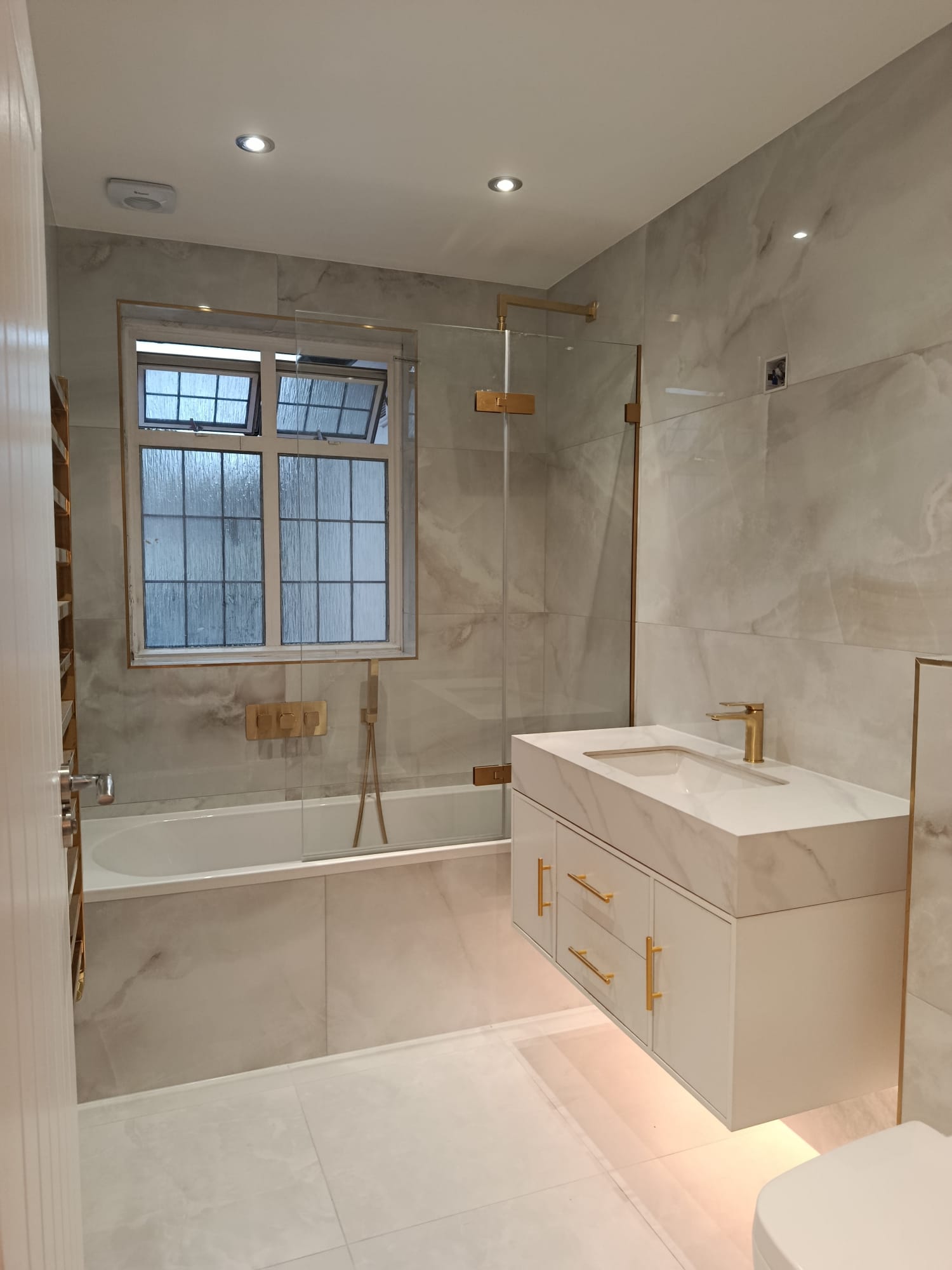
Pure white tiles are often seen as the obvious answer for a small bathroom, but they do not always create the best result. In some rooms they can feel too sharp, too sterile or too unforgiving under artificial light. Warm neutrals often create a more comfortable and premium atmosphere while still helping the room feel bright.
Soft stone tones, warm off-whites, pale taupes and muted sandy colours often work especially well because they reflect light gently without draining the space of warmth. They also tend to pair more naturally with wood-effect finishes, brassware and softer lighting.
3. Light grey can work, but it needs care
Light grey has been a popular bathroom tile colour for years because it feels safe, modern and easy to pair with other finishes. It can still work well in a small bathroom, but only if it does not make the room feel flat or cold. Grey usually looks better when it has some warmth or mineral softness to it, rather than a harsh blue undertone.
In many smaller bathrooms, a softer greige or warm stone-grey often works better than a colder urban grey. The final effect also depends heavily on lighting, mirror size and the rest of the finish scheme.
4. Dark tile colours are possible, but not always forgiving
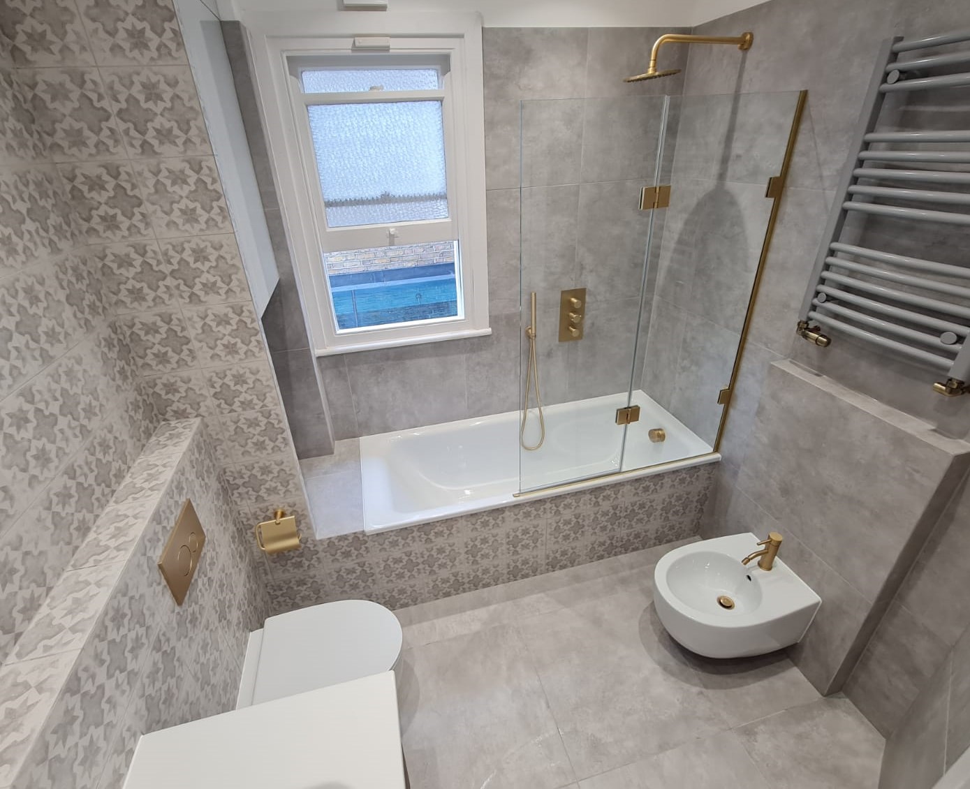
Darker bathroom tiles can look dramatic and sophisticated, but they need to be used with more care in a small room. Deep charcoal, dark green, navy or black tones can create a beautiful mood, yet they can also reduce the sense of openness if the room already struggles for light or visual breathing space.
That does not mean darker colours should never be used. They can work extremely well as accents, on selected walls or in more controlled combinations. The key is that the room needs enough balance around them so the bathroom still feels intentional rather than compressed.

5. One calm palette usually works better than too much contrast
Small bathrooms tend to look stronger when the palette feels edited. Too much contrast between walls, floors, feature areas and grout can make the room feel more cut up than it needs to. A calmer tonal approach usually allows the eye to move through the space more easily.
That does not mean the room has to be dull. Depth can still come from texture, subtle tone shifts, brass details, mirror shapes and lighting. The difference is that the contrast is controlled rather than everywhere at once.
If you are still working out the wider finish direction, continue with Bathroom Tile Ideas.
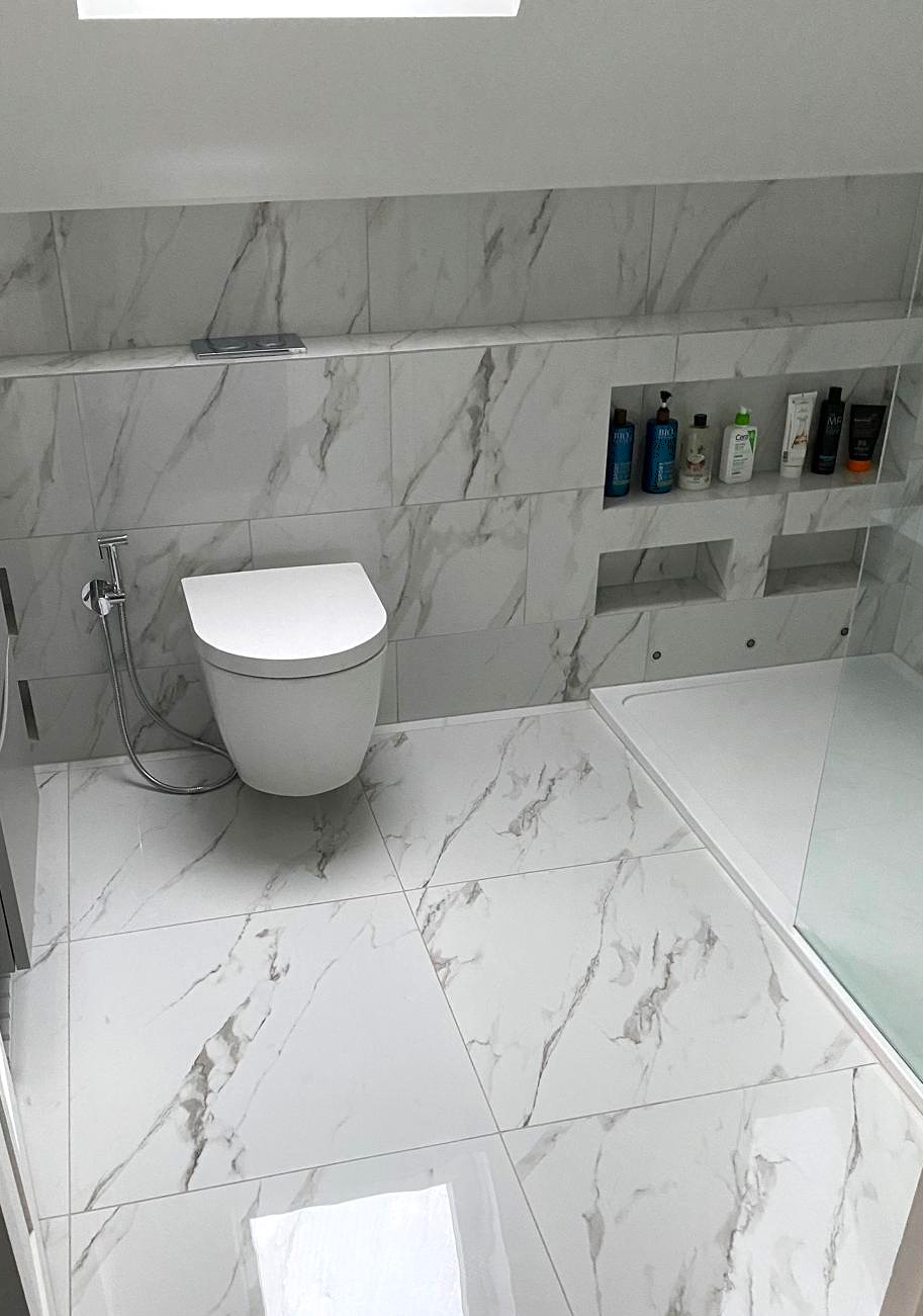
6. Floor and wall colours should support each other
A common problem in small bathrooms is choosing a floor tile and wall tile that each look good on their own but do not work together. The result is a room that feels visually disconnected. In a compact bathroom, the floor should usually support the wall palette rather than compete with it aggressively.
In many cases, the most effective solution is a palette where the wall and floor colours relate naturally. That may mean tonal variation rather than dramatic contrast. It may also mean letting the floor carry slightly more depth while the walls stay lighter and calmer.
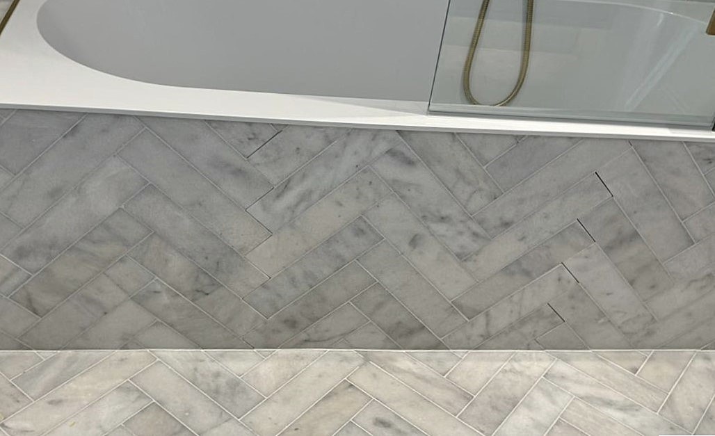
7. Grout tone can sharpen or soften the whole scheme
Even when the tile colour itself is right, the grout can push the room in a very different direction. Strong grout contrast often creates a more graphic and structured effect, while tonal grout usually softens the pattern and keeps the room calmer.
In small bathrooms, tonal grout often helps because it reduces visual interruption. But again, the best answer depends on the look you want. If the room needs softness and openness, the grout should support that rather than fight against it.
8. Tile colour should work with the shower and lighting choices
Tile colour never works in isolation. In a small bathroom, the shower glass, lighting style and mirror placement all affect how the colours will actually feel in the finished room. A warm neutral tile might feel beautiful in natural light but too dull under poor artificial lighting. A cooler tile may work well if the room has enough softness elsewhere, but feel harsh if everything is crisp and reflective.
This is why bathroom planning works best as a joined-up process. Colour, tile size, lighting and setup decisions all support each other. If one element changes, the rest of the scheme often needs reviewing too.
To follow those threads, continue with How to Design a Small Bathroom With a Shower and Bathroom Lighting Ideas.
Best tile colour directions for a small bathroom
- Warm off-white: bright but softer than pure white, often more premium and forgiving.
- Soft stone beige: warm, calm and highly versatile across many bathroom styles.
- Pale greige: useful when you want a more modern neutral without making the room feel cold.
- Mineral light grey: works best when the tone stays soft and the lighting is good.
- Muted taupe: a strong choice when the room needs warmth and a more grounded feel.
Common colour mistakes in a small bathroom
- Choosing white tiles that make the room feel cold rather than clean.
- Using strong contrast everywhere instead of building one calm palette.
- Ignoring how grout changes the overall effect of the tile colour.
- Choosing dark tones without checking the room’s light levels.
- Picking floor and wall colours separately with no overall balance.
- Forgetting that mirror lighting and artificial light will change how colours actually read.
Need help choosing the right finish direction for your bathroom?
Answer a few quick questions about your style, layout and priorities to get a free bathroom planning report with more tailored guidance.
Get Your Free Bathroom Planning ReportRelated planning guides
Smarter bathroom planning, design inspiration and fitting guidance for London homeowners.
© Copyright 2026 Bathroom Converter. All rights reserved